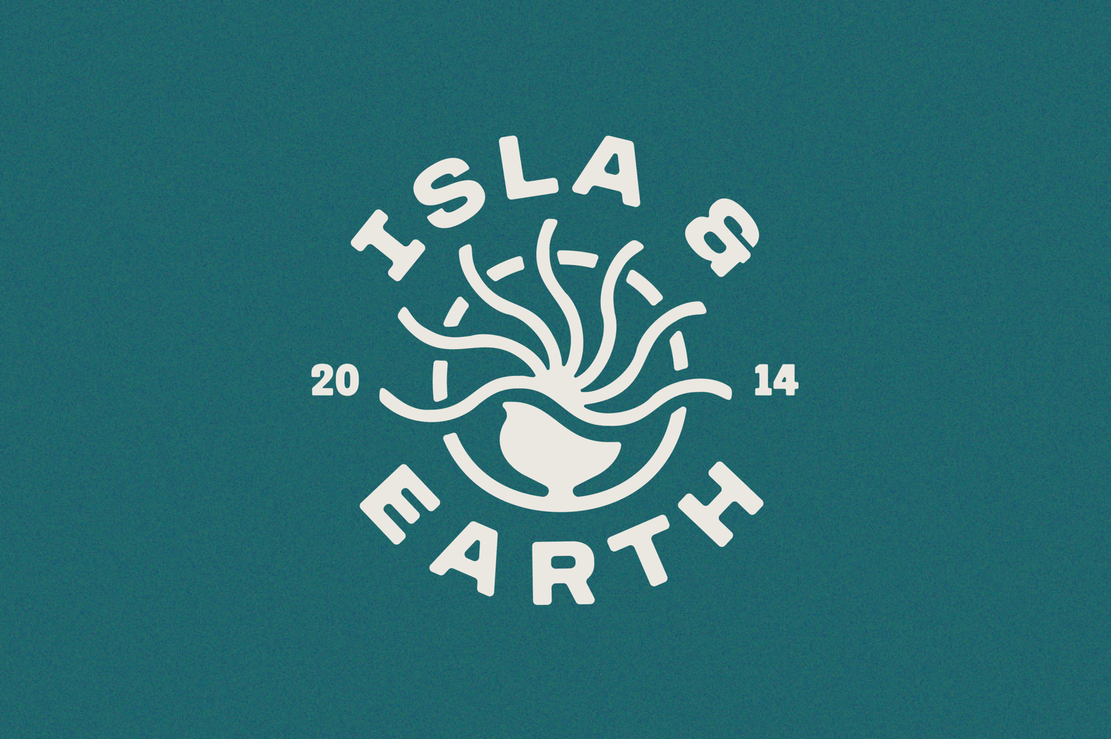
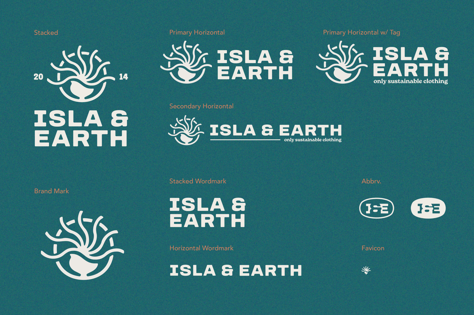
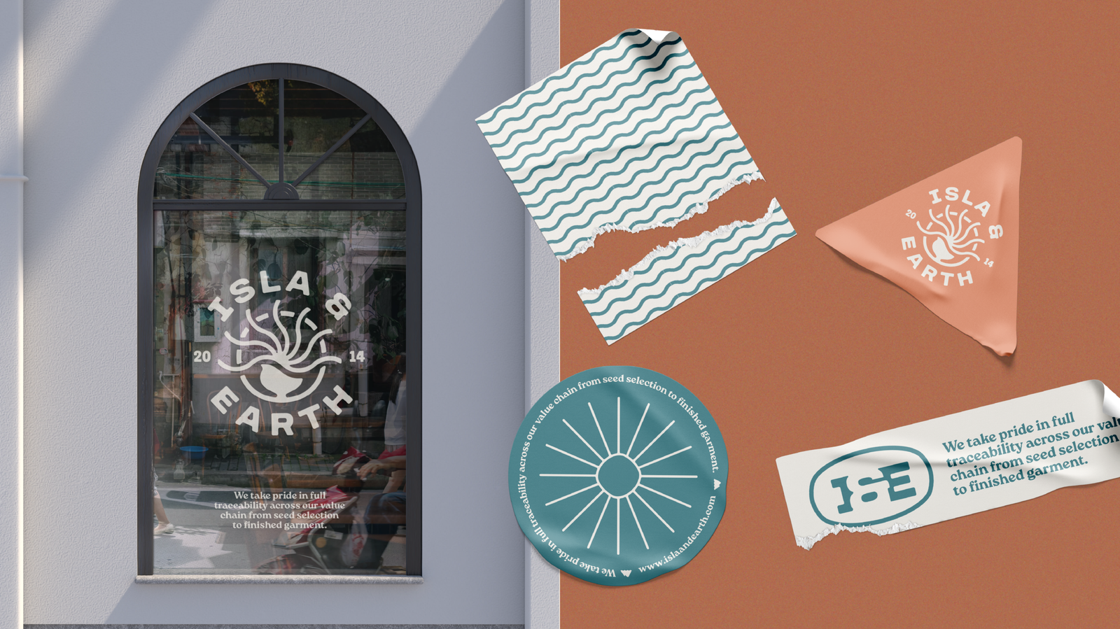
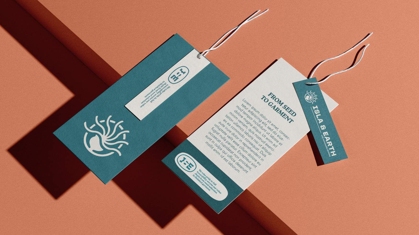
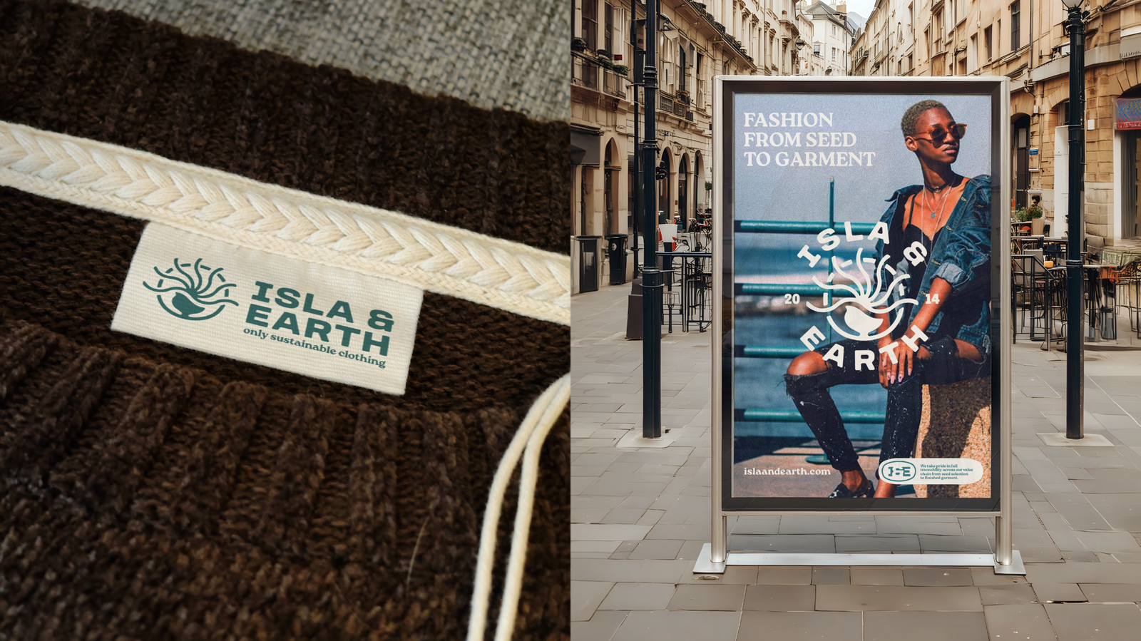
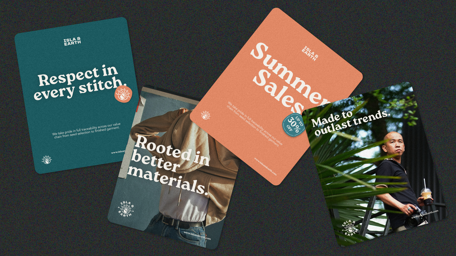
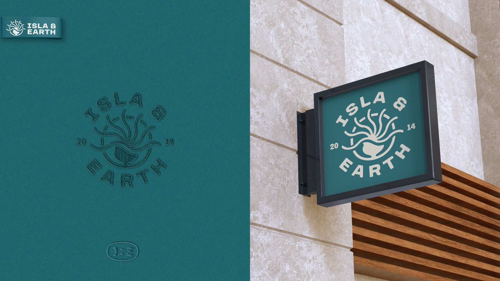
a logo reflecting the roots of the brand

Isla and Earth isn’t just another sustainabilty brand, it strives to research where the clothing comes from.  It ensure that all apparel is controlled from “seed to garment”.  The visual identity represtents this through the use of the name, the founder’s nationality and the organic feel.

A more detailed case study coming soon.

Building the logo mark

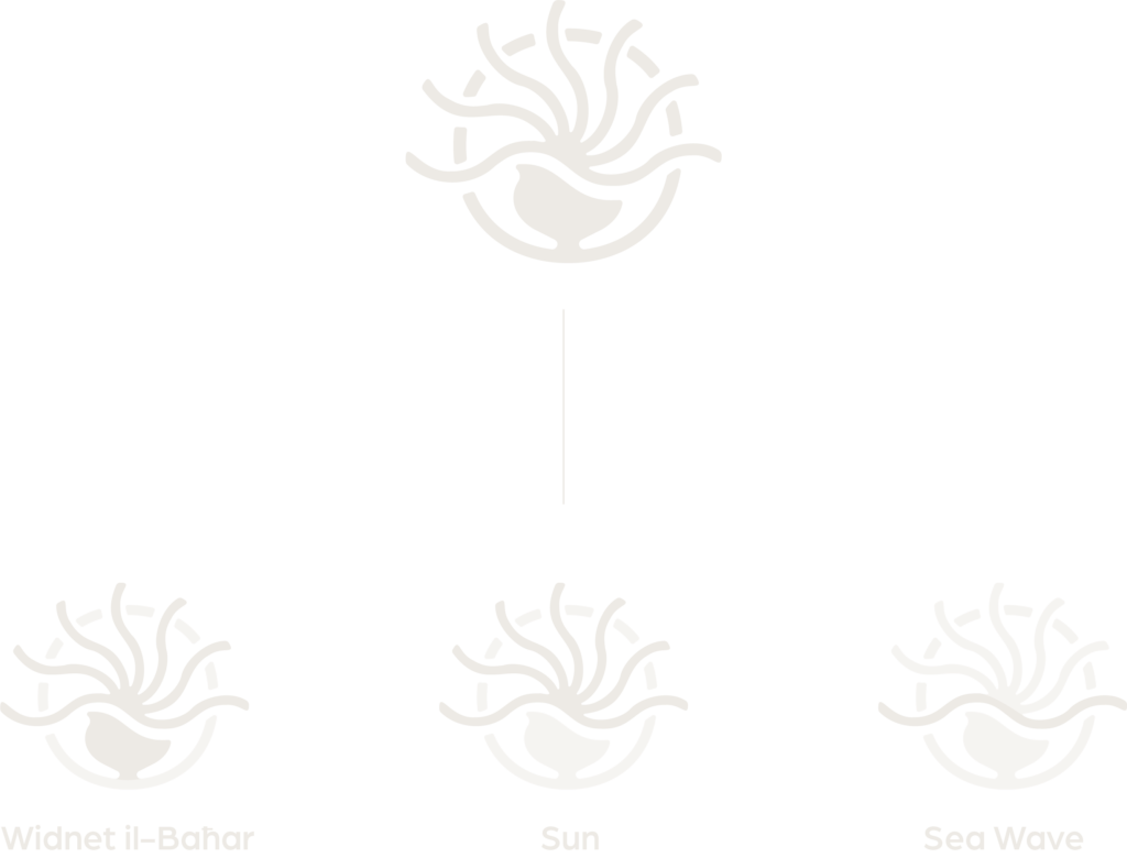
This logomark is a combination of elements that reflect the name ‘Isla and Earth’. The design is based on the Widnet il-Baħar, the Maltese national flower found on cliffs overlooking the sea. This flower represents both the earth and the island. Hidden within the logo are a wave to symbolise the sea and a sun to reflect the warmth of the Mediterranean.